Content Warning: Guns (briefly)
I'm back for another summary! Last year's was just so fun, so I had to do one this year too, especially since I was on a rollercoaster of art style changes.
As before, here's the full versions and why I drew them!
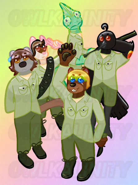
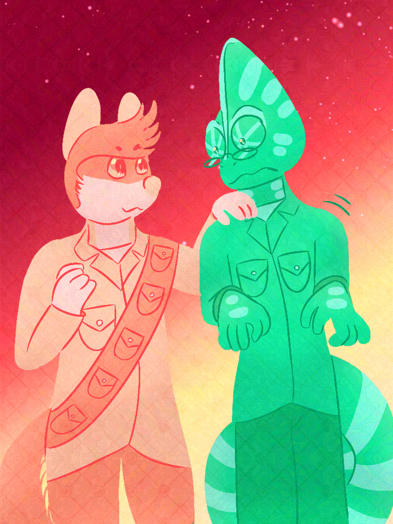
This was one of the pieces I posted to my Bluesky, so you've probably seen it before. I still like it, though I'd redo it with cel shading in the future. Phil's big-ass hand still kills me, because I know it was perspective, but it just looks like yaoi hands. Also, for some reason, I decided to use lighting in their accent colours, which just doesn't look good on Phil's hand or on Phoenix, though everyone else is okay.
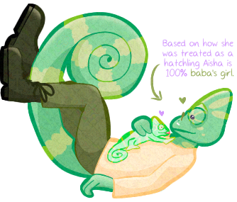
This drawing is just... so cute. Aisha is a precious little bean, and Léon adores her. What more is there to say? While I remember, I still recall trying to model this pose myself, mostly to see how Léon's boots would bend. The idea was that he was against a wall, which doesn't really carry across.
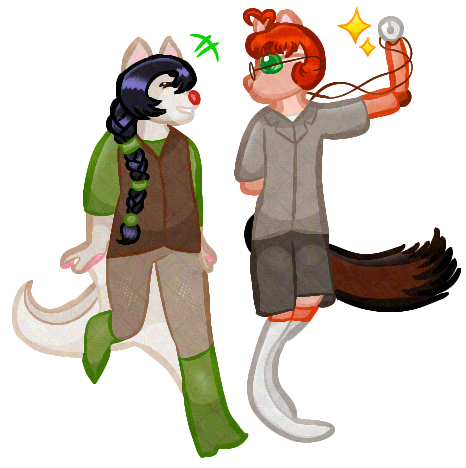
I'm fairly certain the only purpose of this image was to try and draw prosthetics. I feel like they look all right, but I don't like the sudden lineart thickness changes.
This colour scheme was originally based on a palette called "Hard Feelings" I found on Pinterest, made by Angelica Nyneave on Instagram according to the watermark. The drawing was supposed to have Léon in a large crowd, but it gradually turned into just him and Michel instead, because I didn't like the idea of drawing perspective for a street (something I rectified a few months later, as you'll see). I think the idea still carried across—Léon feeling markedly different from the world for a variety of reasons you'll see when I get The West, With Glory done.
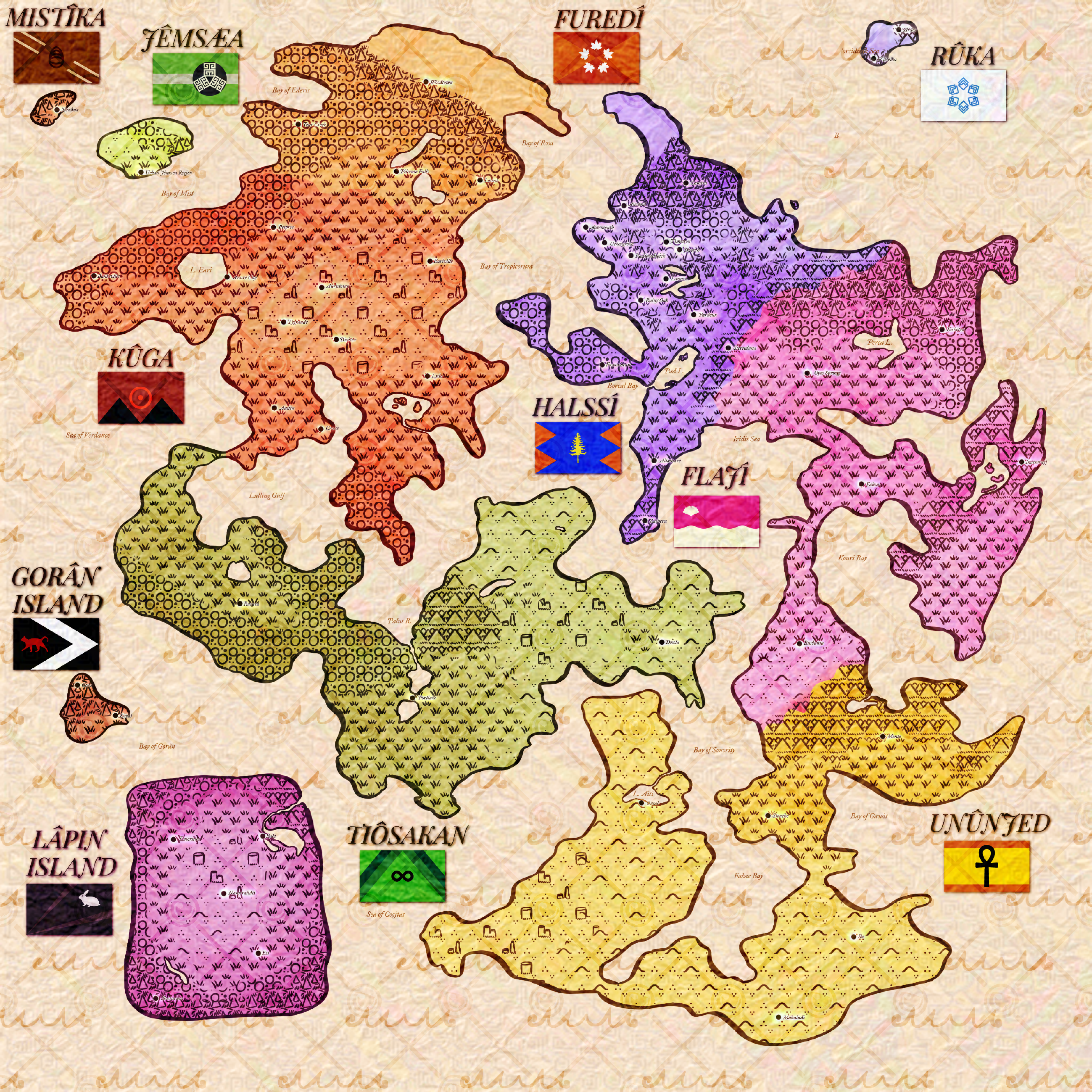
This is Mapicca's map, with all the ridiculous detail you might expect. I highly, highly suggest opening this image in a new tab and zooming in. The website version really can't do the detail justice. However, note that every single country name is misspelled now, thanks to my updates to Mapaalii as a language.
As a side note, every flag on this map was made with Flag Machine (except the ankh on Ununjed's, and Kuga's uses one of the palettes inverted).
I wanted some random, silly profile picture for fun, so I drew this. This is my current profile picture on Ellipsus. This was also a case of my trying out more "standard" furry anatomy... and promptly hating it. I don't want any of you to be faced with the reality of my tit size whenever you see my avatar! I do, however, think my face is adorable here.
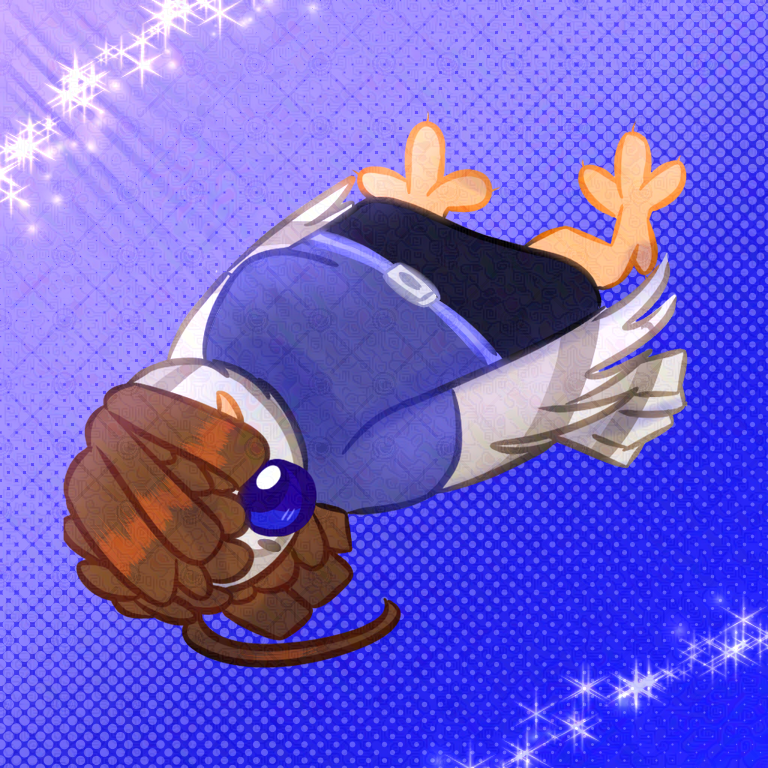
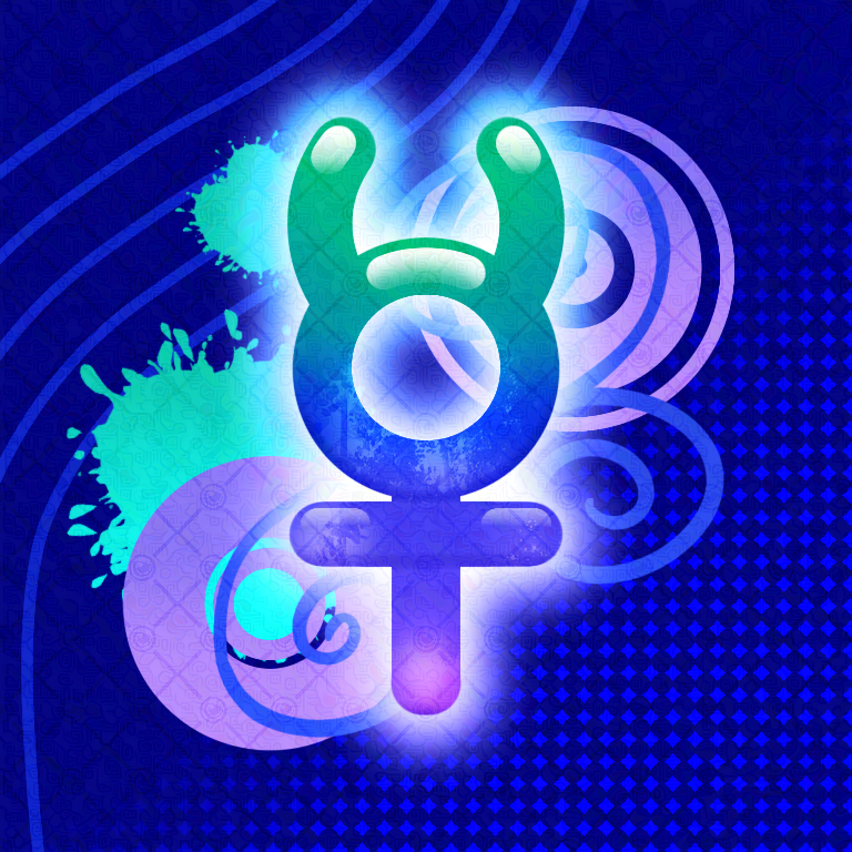
I got really into frutiger aero aesthetic this year, probably out of nostalgia and joining everyone else's desire for the world to be Like That instead. This was a frutiger aero/metro piece I did for a side project of mine, my Petz fansite Hydrargyry Kennelz, so if you've seen it floating around elsewhere online, that's why!
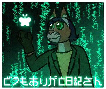
My poor Japanese text got mangled in my attempts at pixel-text-ing it, so 'thank you for villa', Mr. Notebook. At least the flowy, Matrix-y text in the back is correct, albeit distorted. Interestingly, the bottom text originally was going to read "AI-san" instead of "Nikki-san", but I decided not to go with that for obvious reasons, even though Nikola is an AI. The fun kind, not the crappy generative kind.
As a side note, this is the first piece on this summary where I used self-colouring lineart. Hard to believe it was this late in the year, because it feels like I've been doing this kind of lineart forever!
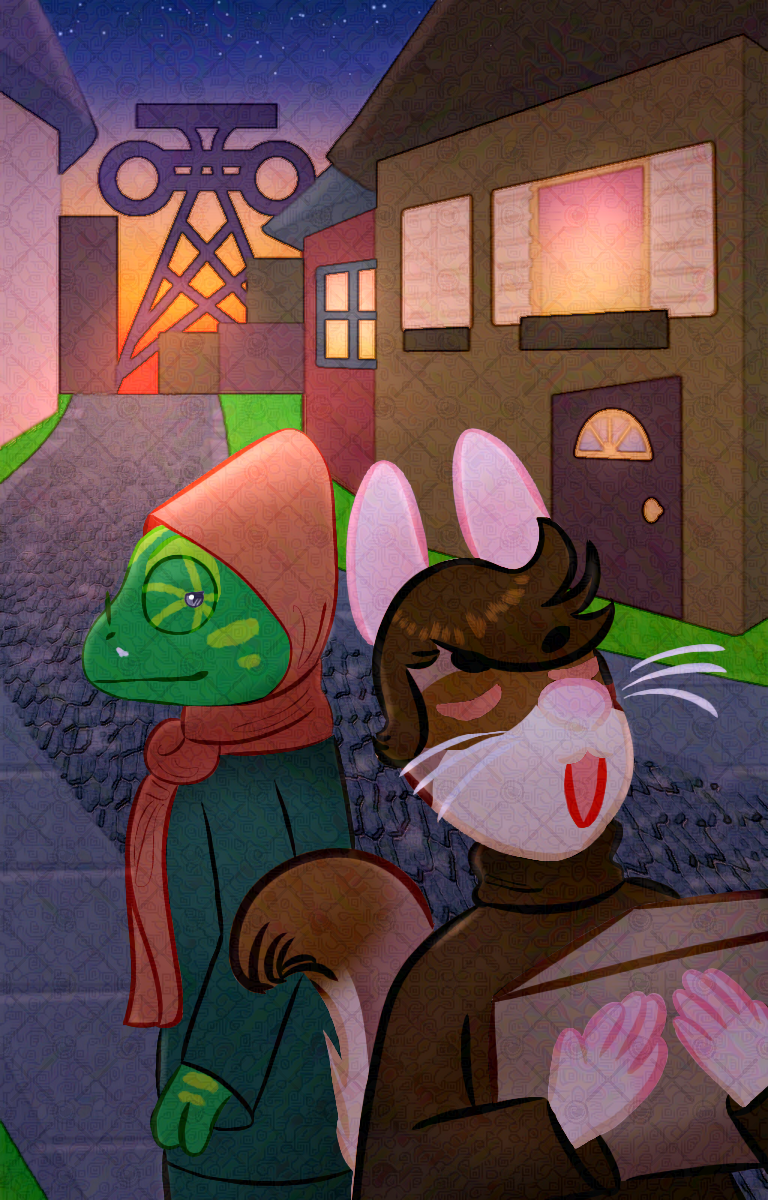
If I had a nickel for when I put one of my covers for something non-canon into my year-end art summary, I'd have two nickels, you know the rest. This was for a cute little AU where my current-favourite TWWG duo Michel and Léon move to Pardeux, Frons, instead of... well, that's a TWWG spoiler.
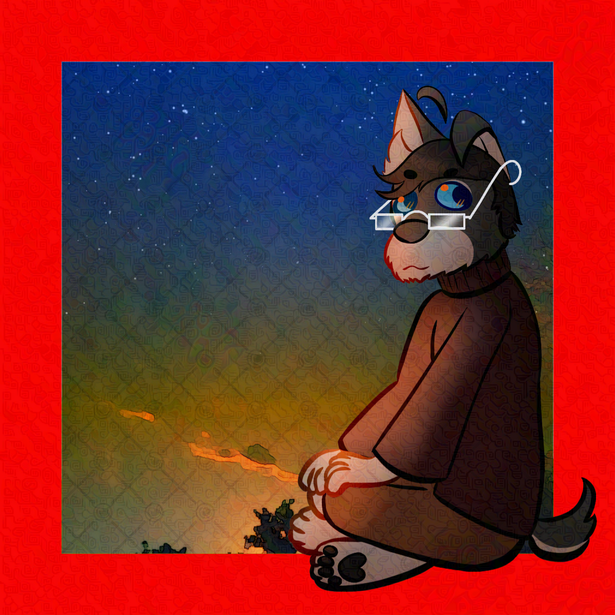
This was one of eight pieces I did as part of a project to represent my characters with songs from their character playlists. I could have put any of them here, but I wanted to use Win's because I don't show him off enough. The sunset in the background is a real photo I took, run through IbisPaint's "anime background" filter.
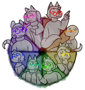
This was the results of an idea I had to do one of those colour wheel challenges, but with my character's glasses. I did in fact find a character for each colour, though some of them are really deep cuts (looking at you, Mysari, Bash, and Melissa).
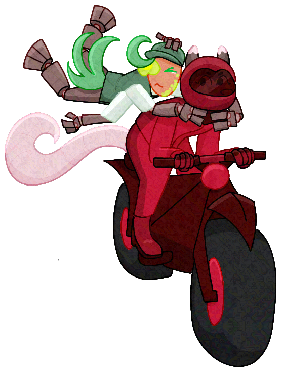
If you're unaware, Book About Motorcross is the odd one out of my books because 1) it isn't set in Mapicca, and 2) there are anthro plants as well as animals. Egbert here is a wood spurge.
This was another one I put on Bluesky, and my thoughts on it still stand: this was really a return to form for me. All my experimentation this year—coloured outlines, soft shading, anatomy changes—it all solidified into me keeping what I liked and reverting what I didn't. Self-colouring outlines are staying (even if they are a trend right now that will probably die in about a month—I was doing it before it was cool) because I like how it looks. I'm going back to cel shading because I like how it looks. And I may try to increase the realism again, but for now, this style is still where it's at for me.
Back to top